HTML Academy
Laying out a simple page: the final step
Introduction to Grid Layout28/32
Back to the list of tasks
  • 1. The grid item’s position: grid-row-start and grid-column-start
  • 2. The grid item’s position: grid-column-start and grid-column-end
  • 3. The grid item’s position: grid-row-start and grid-row-end
  • 4. Negative values for grid-column-start and grid-column-end
  • 5. Negative values for grid-row-start and grid-row-end
  • 6. Grid item overlay
  • 7. Overlaying grid items and the z-index property
  • 8. Summary of “Grids: positioning grid items”
  • 9. Test: Building bridges
  • 10. Named grid areas: the grid-template-areas property
  • 11. The grid-template-areas property and empty grid areas
  • 12. Automatic coordinates of the grid items: columns
  • 13. Automatic coordinates of elements in the grid: columns and rows
  • 14. Combining automatic and explicit coordinates
  • 15. Combining automatic and explicit coordinates, part 2
  • 16. Unfixed column width
  • 17. Unfixed column and row widths
  • 18. Grid spacing: the gap property
  • 19. Grid spacing: the row-gap and column-gap properties
  • 20. Summary of “Creating layouts using grids”
  • 21. Test: Laying out a park
  • 22. Laying out a simple page: creating a grid
  • 23. Laying out a simple page: the header
  • 24. Laying out a simple blog page: the promo block
  • 25. Laying out a simple page: the sidebar
  • 26. Laying out a simple blog page
  • 27. Laying out a simple page: the final step
  • 28. Laying out the online store catalog: creating an internal grid
  • 29. Laying out an online store catalog: the “Sort by” block
  • 30. Laying out an online store catalog: the filter block
  • 31. Laying out an online store catalog: the final step
  • 32. Test: The grid layout of a page
Laying out an online store catalog: the “Sort by” block
  • Sign up
  • Log in

Loading…
Everything will be ready in few seconds

  • Theory
  • Theory
  • Comments

Laying out the online store catalog: creating an internal grid

We did a great job with the previous assignments, but this is not the time to rest on our laurels.

The second interface that we can lay out using grids will be our online store catalog. And just like any catalog, we can also find the following elements here: a footer, a filter, “Sort by” block, an assortment of products for sale, and a footer.

Well, and just to make sure that you don’t get bored as well as to introduce you to a device that will come in handy in real projects, we’ll take the part with the header and footer from the previous page and make a frame out of it. Assign the inner-grid class to the general container, which means the “inner” page. We’ll arrange various content inside, which will form an independent unit, which allows us to make corrections without breaking anything, and it is also easy to replace it with something else.

Here’s what the resulting grid will look like:

Schematic representation of the page grid

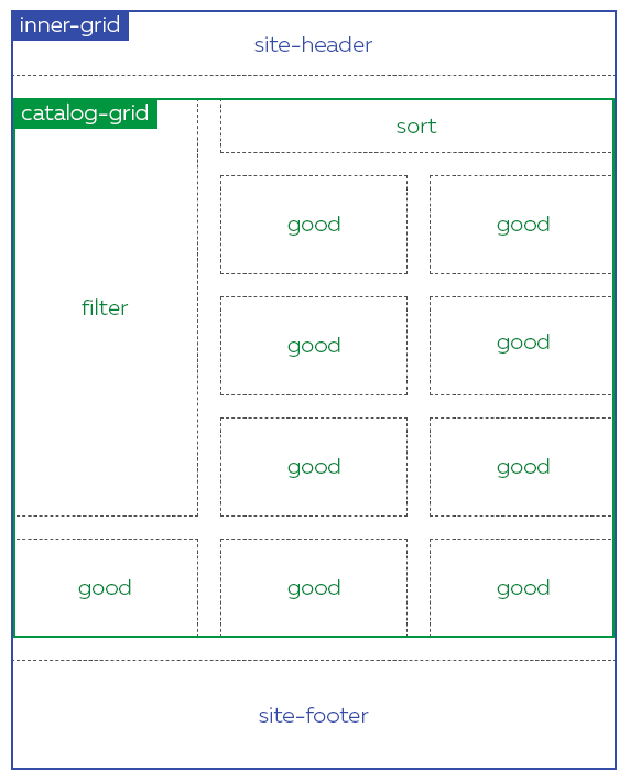
Please note the source code for the assignment: the .inner-grid block consists of three rows: the footer has a fixed size, the row with the header has an automatically determined height, just like in the previous assignment, and the remaining space is reserved for the content:

.inner-grid {
  display: grid;
  grid-template-rows: auto auto 100px;
}

The .catalog-grid block is used as a content area, which we will also make a grid in turn. One grid will fit inside the second. It’s magic!

Let’s start, just like we did last time, by creating a grid, setting the grid spacing, and declaring a three-column grid.

Comments

  • index.html
  • style.css
HTML
<!DOCTYPE html> <html lang="en"> <head> <meta charset="utf-8"> <title>Laying out the online store catalog: creating an internal grid</title> <link href="lopatkin.css" rel="stylesheet"> <link href="style.css" rel="stylesheet"> </head> <body> <div class="inner-grid"> <header class="site-header"> <nav class="site-nav"> <a class="logo"> <img src="logo.svg" width="40" height="40" alt=""> Lopatkin </a> <a href="#">About Us</a> <a href="#">Catalog</a> <a href="#">Blog</a> </nav> </header> <main class="catalog-grid"> <h1 class="visually-hidden">Garden accessories catalog</h1> <section class="filter"> <h2>Filter</h2> <form class="filter-form" action="https://echo.htmlacademy.ru/courses"> <fieldset> <legend>Price:</legend> <p class="filter-price"> <label> <input type="radio" name="prices" value="1"> 1–1000 </label> <label> <input type="radio" name="prices" value="2"> 1001–5000 </label> </p> </fieldset> <fieldset> <legend>Brand:</legend> <p class="filter-brands"> <label> <input type="checkbox" name="brand-lopatkin" value="1"> Lopatkin </label> <label> <input type="checkbox" name="brand-gardener" value="1"> Gardener </label> <label> <input type="checkbox" name="brand-gnomhouse" value="1"> Gnom house </label> <label> <input type="checkbox" name="brand-mrpot" value="1"> Mr. Pot </label> <label> <input type="checkbox" name="brand-grasson" value="1"> Grass On </label> </p> </fieldset> <button type="submit">Submit</button> </form> </section> <section class="sort"> <h2>Sort</h2> <ul> <li><a href="#">By price</a></li> <li><a href="#">By rating</a></li> </ul> </section> <article class="good"> <h2 class="good-name">Table made of girders</h2> <img src="chairs.jpg" width="168" height="70" alt="Table made of girders"> </article> <article class="good"> <h2 class="good-name">Decorative stone</h2> <img src="stones.jpg" width="168" height="70" alt="Decorative stone"> </article> <article class="good"> <h2 class="good-name">Garden gnome</h2> <img src="gnomes.png" width="168" height="70" alt="Garden gnome"> </article> <article class="good"> <h2 class="good-name">Pot</h2> <img src="pots.jpg" width="168" height="70" alt="Pot"> </article> <article class="good"> <h2 class="good-name">Hedge trimmer</h2> <img src="tools.jpg" width="168" height="70" alt="Hedge trimmer"> </article> <article class="good"> <h2 class="good-name">Lantern</h2> <img src="light.jpg" width="168" height="70" alt="Lantern"> </article> </main> <footer class="site-footer"> <a class="vkontakte" href="https://vk.com/htmlacademy">VK</a> <a class="facebook" href="https://www.facebook.com/htmlacademy">Facebook</a> <a class="instagram" href="https://instagram.com/htmlacademy">Instagram</a> </footer> </div> </body> </html>
CSS
.inner-grid { display: grid; width: 550px; margin-left: auto; margin-right: auto; gap: 20px; grid-template-columns: 170px 170px 170px; grid-template-rows: auto auto 100px; } .site-header { grid-column-start: 1; grid-column-end: 4; } .site-footer { grid-column-start: 1; grid-column-end: -1; }

What didn’t you like in this task?

Thanks! We’ll fix everything at once!

The code has changed, click “Refresh” or turn autorun on.

You’ve gone to a different page

Click inside the mini-browser to shift the focus onto this window.

100%
Goalscompleted
0
    1. Set the grid display for the .catalog-grid block,
    2. as well as grid spacing of 20px between the grid columns and rows,
    3. and then create three columns, where each is 170px in size.

    Cookies ∙ Privacy ∙ License Agreement ∙ About ∙ Contacts ∙ © HTML Academy OÜ, 2019−2025

    VISAMastercard

    Log in

    or

    Forgot your password?

    Sign up

    Sign up

    or
    Log in

    Restore access

    Have you forgotten your password or lost access to your profile? Enter your email connected to your profile and we will send you a link to restore access.

    Forgot to connect your email to the profile? Email us and we’ll help.