HTML Academy
Previous task
Introduction to Grid Layout1/32
Back to the list of tasks
  • 1. The grid item’s position: grid-row-start and grid-column-start
  • 2. The grid item’s position: grid-column-start and grid-column-end
  • 3. The grid item’s position: grid-row-start and grid-row-end
  • 4. Negative values for grid-column-start and grid-column-end
  • 5. Negative values for grid-row-start and grid-row-end
  • 6. Grid item overlay
  • 7. Overlaying grid items and the z-index property
  • 8. Summary of “Grids: positioning grid items”
  • 9. Test: Building bridges
  • 10. Named grid areas: the grid-template-areas property
  • 11. The grid-template-areas property and empty grid areas
  • 12. Automatic coordinates of the grid items: columns
  • 13. Automatic coordinates of elements in the grid: columns and rows
  • 14. Combining automatic and explicit coordinates
  • 15. Combining automatic and explicit coordinates, part 2
  • 16. Unfixed column width
  • 17. Unfixed column and row widths
  • 18. Grid spacing: the gap property
  • 19. Grid spacing: the row-gap and column-gap properties
  • 20. Summary of “Creating layouts using grids”
  • 21. Test: Laying out a park
  • 22. Laying out a simple page: creating a grid
  • 23. Laying out a simple page: the header
  • 24. Laying out a simple blog page: the promo block
  • 25. Laying out a simple page: the sidebar
  • 26. Laying out a simple blog page
  • 27. Laying out a simple page: the final step
  • 28. Laying out the online store catalog: creating an internal grid
  • 29. Laying out an online store catalog: the “Sort by” block
  • 30. Laying out an online store catalog: the filter block
  • 31. Laying out an online store catalog: the final step
  • 32. Test: The grid layout of a page
The grid item’s position: grid-column-start and grid-column-end
  • Sign up
  • Log in

Loading…
Everything will be ready in few seconds

  • Theory
  • Theory
  • Comments

The grid item’s position: grid-row-start and grid-column-start

Grids are a new system for creating page layouts. Though they are a recent innovation, modern browsers have good support for them. Perhaps you have already learned about other systems for creating grids from our other courses, and perhaps the following question occurred to you: why do we need grids if we have flexboxes, for example? The fact is that, unlike flexboxes, grids allow us to work with columns and rows at the same time, which is a great feature, isn’t it? But let’s not get ahead of ourselves. We will discuss all of the details in due course.

In the first part of the chapter, we will study how grids can be used to create a landscape design, we will try to build a grid layout while imagining that the grid is a map of the area, and we will draw up a visual plan of how objects will be placed in this area.

After you become a seasoned landscape designer, we will move on to the second part of the chapter, where we will use grids to create simple layouts on real pages that are similar to those found on the Internet. You have probably already created something similar using floats, CSS tables, and flexboxes.

And so, in order to create a block using a grid container, you need to assign it the corresponding value for the display property:

.container {
  display: grid;
}

The immediate child elements in the grid container will become its grid items, and then they will be placed in accordance with the grid layout.

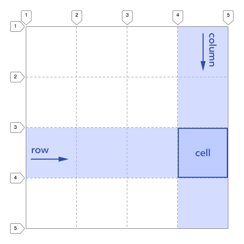
As we already mentioned, grid items are arranged in a two-dimensional grid. In other words, the grid consists of rows and columns located between lines, which are numbered sequentially as shown in the illustration below.

Schematic representation of grid lines

In order to place an element inside a grid, you need to set coordinates for it. In other words, it’s like you are forcing the item to say:

I am a grid item starting at this column line and that row line.

When we set the start coordinate for a grid item as a particular row or column, it automatically extends to the next line of rows or columns and thus forms a grid cell.

In the example above, a cell starts on the 4th column line and the 3rd row line.

In the code, we do this using the grid-column-start and grid-row-start properties.

Example:

grid-column-start: 4 means that the element starts with the 4th column line.
grid-row-start: 3 means that the element starts with the 3rd row line.

Let’s get started with the first assignment. We have a grid that consists of 4 rows and 4 columns. Let’s try to assign properties to the element in this grid whereby it will start at a certain row line and a certain column line.

Comments

  • index.html
  • style.css
HTML
<!DOCTYPE html> <html lang="en"> <head> <meta charset="utf-8"> <title>The grid item’s position: grid-row-start and grid-column-start</title> <link href="world.css" rel="stylesheet"> <link href="style.css" rel="stylesheet"> </head> <body class="world"> <div class="land land--guided land--task-1"> <div class="element element--water">Water</div> </div> </body> </html>
CSS
.land { display: grid; grid-template-columns: 125px 125px 125px 125px; grid-template-rows: 125px 125px 125px 125px; }

What didn’t you like in this task?

Thanks! We’ll fix everything at once!

The code has changed, click “Refresh” or turn autorun on.

You’ve gone to a different page

Click inside the mini-browser to shift the focus onto this window.

100%
Goalscompleted
0
    1. For the .element block set the starting coordinate of the column grid item grid-column-start: 2;,
    2. and also assign the starting coordinate for the rows grid-row-start: 3;.

    Cookies ∙ Privacy ∙ License Agreement ∙ About ∙ Contacts ∙ © HTML Academy OÜ, 2019−2025

    VISAMastercard

    Log in

    or

    Forgot your password?

    Sign up

    Sign up

    or
    Log in

    Restore access

    Have you forgotten your password or lost access to your profile? Enter your email connected to your profile and we will send you a link to restore access.

    Forgot to connect your email to the profile? Email us and we’ll help.