HTML Academy
The grid-template-areas property and empty grid areas
Introduction to Grid Layout12/32
Back to the list of tasks
  • 1. The grid item’s position: grid-row-start and grid-column-start
  • 2. The grid item’s position: grid-column-start and grid-column-end
  • 3. The grid item’s position: grid-row-start and grid-row-end
  • 4. Negative values for grid-column-start and grid-column-end
  • 5. Negative values for grid-row-start and grid-row-end
  • 6. Grid item overlay
  • 7. Overlaying grid items and the z-index property
  • 8. Summary of “Grids: positioning grid items”
  • 9. Test: Building bridges
  • 10. Named grid areas: the grid-template-areas property
  • 11. The grid-template-areas property and empty grid areas
  • 12. Automatic coordinates of the grid items: columns
  • 13. Automatic coordinates of elements in the grid: columns and rows
  • 14. Combining automatic and explicit coordinates
  • 15. Combining automatic and explicit coordinates, part 2
  • 16. Unfixed column width
  • 17. Unfixed column and row widths
  • 18. Grid spacing: the gap property
  • 19. Grid spacing: the row-gap and column-gap properties
  • 20. Summary of “Creating layouts using grids”
  • 21. Test: Laying out a park
  • 22. Laying out a simple page: creating a grid
  • 23. Laying out a simple page: the header
  • 24. Laying out a simple blog page: the promo block
  • 25. Laying out a simple page: the sidebar
  • 26. Laying out a simple blog page
  • 27. Laying out a simple page: the final step
  • 28. Laying out the online store catalog: creating an internal grid
  • 29. Laying out an online store catalog: the “Sort by” block
  • 30. Laying out an online store catalog: the filter block
  • 31. Laying out an online store catalog: the final step
  • 32. Test: The grid layout of a page
Automatic coordinates of elements in the grid: columns and rows
  • Sign up
  • Log in

Loading…
Everything will be ready in few seconds

  • Theory
  • Theory
  • Comments

Automatic coordinates of the grid items: columns

OK, so we have learned how to save time and use named areas! Cool!

But let’s now go back to the very beginning, to the first assignments that we completed in this chapter. For these assignments, we had to work with a grid whose fixed width was defined by a 4-by-4 cell. Attentive students probably already noticed the mysterious properties of grid-template-columns and grid-template-rows. What kind of properties are these?

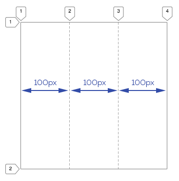
The grid-template-columns property lists the number and width of future grid columns. For example, the grid-template-columns: 100px 100px 100px; entry tells the grid:

You will have three columns that are each 100px wide.

Schematic representation of a grid with three columns

But what happens to rows at this time?

If you do not specify any parameters for rows, then they can vary in number. The sequence of actions is as follows:

  1. All grid items are arranged in a single row according to the declared column layout.
  2. If there are more grid items than columns, then the elements that do not fit into a single row will overflow into the next row and fill it.
  3. New rows are generated until all of the grid items populate the columns of the layout. If the last row is not completely filled with elements, then this residual space in the grid remains empty.

Consider the following example. Take the grid with the five elements that have been assigned a single column. According to the layout, it turns out that only one grid item can fit in the first row of the grid. The remaining elements will be transferred to the new rows, and thus they will form five rows. That is, they will line up in a column:

If we increase the number of columns to two, then two elements will be able to be placed in each row. In other words, the elements will form a total of three rows. The first and second rows will contain two elements each, and the third row will contain one row.

As far as the height of the rows is concerned, it will be distributed evenly so that the rows fill the entire grid space.

Well, to make everything completely clear, let’s move on to best practices.

Comments

  • index.html
  • style.css
HTML
<!DOCTYPE html> <html lang="en"> <head> <meta charset="utf-8"> <title>Automatic coordinates of elements in the grid: columns</title> <link href="world.css" rel="stylesheet"> <link href="style.css" rel="stylesheet"> </head> <body class="world"> <div class="land"> <div class="element element--water element--simple">1</div> <div class="element element--grass element--simple">2</div> <div class="element element--rocks element--simple">3</div> <div class="element element--lava element--simple">4</div> <div class="element element--sand element--simple">5</div> </div> </body> </html>
CSS
.land { display: grid; }

What didn’t you like in this task?

Thanks! We’ll fix everything at once!

The code has changed, click “Refresh” or turn autorun on.

You’ve gone to a different page

Click inside the mini-browser to shift the focus onto this window.

100%
Goalscompleted
0
    1. For the .land block, set the grid-template-columns: 100px;, property,
    2. then change the value to 100px 300px.
    3. and finally change it to 100px 300px 100px.

    Cookies ∙ Privacy ∙ License Agreement ∙ About ∙ Contacts ∙ © HTML Academy OÜ, 2019−2025

    VISAMastercard

    Log in

    or

    Forgot your password?

    Sign up

    Sign up

    or
    Log in

    Restore access

    Have you forgotten your password or lost access to your profile? Enter your email connected to your profile and we will send you a link to restore access.

    Forgot to connect your email to the profile? Email us and we’ll help.