HTML Academy
Automatic coordinates of the grid items: columns
Introduction to Grid Layout13/32
Back to the list of tasks
  • 1. The grid item’s position: grid-row-start and grid-column-start
  • 2. The grid item’s position: grid-column-start and grid-column-end
  • 3. The grid item’s position: grid-row-start and grid-row-end
  • 4. Negative values for grid-column-start and grid-column-end
  • 5. Negative values for grid-row-start and grid-row-end
  • 6. Grid item overlay
  • 7. Overlaying grid items and the z-index property
  • 8. Summary of “Grids: positioning grid items”
  • 9. Test: Building bridges
  • 10. Named grid areas: the grid-template-areas property
  • 11. The grid-template-areas property and empty grid areas
  • 12. Automatic coordinates of the grid items: columns
  • 13. Automatic coordinates of elements in the grid: columns and rows
  • 14. Combining automatic and explicit coordinates
  • 15. Combining automatic and explicit coordinates, part 2
  • 16. Unfixed column width
  • 17. Unfixed column and row widths
  • 18. Grid spacing: the gap property
  • 19. Grid spacing: the row-gap and column-gap properties
  • 20. Summary of “Creating layouts using grids”
  • 21. Test: Laying out a park
  • 22. Laying out a simple page: creating a grid
  • 23. Laying out a simple page: the header
  • 24. Laying out a simple blog page: the promo block
  • 25. Laying out a simple page: the sidebar
  • 26. Laying out a simple blog page
  • 27. Laying out a simple page: the final step
  • 28. Laying out the online store catalog: creating an internal grid
  • 29. Laying out an online store catalog: the “Sort by” block
  • 30. Laying out an online store catalog: the filter block
  • 31. Laying out an online store catalog: the final step
  • 32. Test: The grid layout of a page
Combining automatic and explicit coordinates
  • Sign up
  • Log in

Loading…
Everything will be ready in few seconds

  • Theory
  • Theory
  • Comments

Automatic coordinates of elements in the grid: columns and rows

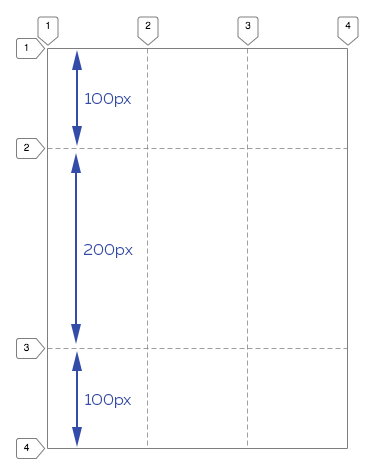
The grid-template-rows property works similarly to grid-template-columns, only it tells the grid how many rows it will contain and what height they will be. For example, the grid-template-rows: 100px 200px 100px; entry tells the grid:

You will have three rows: the first has a height of 100px, the second has a height of 200px, and the third has a height of 100px.

Schematic representation of a grid with three columns and three rows

If the columns are not assigned explicit parameters, then there will only be one column by default, and the elements inside it will be stretched across the entire width of the column.

If the grid contains rows that have not been assigned an explicit height, then the remaining free space to be allocated to height in grid-template-rows will be distributed among them equally.

Thus, you can now create the grids that you need given what you know about how cells are distributed in grids and utilizing the grid-template-columns and grid-template-rows properties.

Comments

  • index.html
  • style.css
HTML
<!DOCTYPE html> <html lang="en"> <head> <meta charset="utf-8"> <title>Automatic coordinates of elements in the grid: columns and rows</title> <link href="world.css" rel="stylesheet"> <link href="style.css" rel="stylesheet"> </head> <body class="world"> <div class="land"> <div class="element element--water element--simple">1</div> <div class="element element--grass element--simple">2</div> <div class="element element--rocks element--simple">3</div> <div class="element element--lava element--simple">4</div> <div class="element element--sand element--simple">5</div> </div> </body> </html>
CSS
.land { display: grid; grid-template-columns: 100px 300px 100px; }

What didn’t you like in this task?

Thanks! We’ll fix everything at once!

The code has changed, click “Refresh” or turn autorun on.

You’ve gone to a different page

Click inside the mini-browser to shift the focus onto this window.

100%
Goalscompleted
0
    1. For the .land block, set the grid-template-rows: 100px; property,
    2. and then change the value to 100px 300px.
    3. Then change the property value grid-template-columns to 100px 300px.

    Cookies ∙ Privacy ∙ License Agreement ∙ About ∙ Contacts ∙ © HTML Academy OÜ, 2019−2025

    VISAMastercard

    Log in

    or

    Forgot your password?

    Sign up

    Sign up

    or
    Log in

    Restore access

    Have you forgotten your password or lost access to your profile? Enter your email connected to your profile and we will send you a link to restore access.

    Forgot to connect your email to the profile? Email us and we’ll help.