HTML Academy
Frame Image: border-image-slice
Frames and Backgrounds15/33
Back to the list of tasks
  • 1. Preparation
  • 2. Background Size, Step 1
  • 3. Background Size, Step 2
  • 4. Background Borders
  • 5. Background Cropping
  • 6. Multiple Background Images
  • 7. Positioning the background relative to different borders
  • 8. background-repeat: round
  • 9. background-repeat: space
  • 10. Outer Frame
  • 11. Rounding Corners, Part 1
  • 12. Rounding Corners, Part 2
  • 13. Frame Image: border-image-source
  • 14. Frame Image: border-image-slice
  • 15. Slicing Asymmetrical Images
  • 16. Frame Image: border-image-repeat, Part 1
  • 17. Frame Image: border-image-repeat, Part 2
  • 18. Frame Image: border-image-width
  • 19. Frame Image: border-image-outset
  • 20. Muffin’s Royal Frame
  • 21. Muffin’s Eco-Frame
  • 22. Muffin’s Round Frame, Part 1
  • 23. Muffin’s Round Frame, Part 2
  • 24. Challenge: The Sea Wolf
  • 25. Frames and Triangles, Part 1
  • 26. Frames and Triangles, Part 2
  • 27. Frames and Triangles, Part 3
  • 28. Creating an Arrow with a Frame
  • 29. Creating a Round Arrow with a Frame, Part 1
  • 30. Creating a Round Arrow with a Frame, Part 2
  • 31. Real-Life Triangles, Part 1
  • 32. Real-Life Triangles, Part 2
  • 33. Challenge: Jewelry Work
Frame Image: border-image-repeat, Part 1
  • Sign up
  • Log in

Loading…
Everything will be ready in few seconds

  • Theory
  • Theory
  • Comments

Slicing Asymmetrical Images

Compare the following two images:

First frame optionSecond frame option

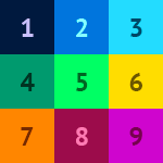
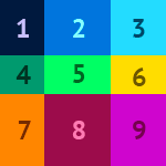
You can set the same margins for the slicing lines of 50px to slice the first image. This is clearly not enough for the second image, since it is less symmetrical.

You can set different margins for the slicing lines using border-image-slice. To do this, you need to assign space-separated values in the following order: top, right, bottom, left. Example:

border-image-slice: 10 20 30 40;

The middle part of the image is usually not used. But if you add the keyword fill to the property value, then the middle part of the image will be displayed in the middle area of the frame: It will cover the background of the block, but it will not cover up the content. Example:

border-image-slice: 10 20 30 40 fill;

Comments

  • index.html
  • style.css
HTML
<!DOCTYPE html> <html lang="en"> <head> <title>Slicing Asymmetrical Images</title> <meta charset="utf-8"> <link rel="stylesheet" href="setting.css"> <link rel="stylesheet" href="style.css"> </head> <body> <div class="portrait"></div> </body> </html>
CSS
.portrait { box-sizing: border-box; margin: 50px auto; padding: 10px; width: 270px; height: 270px; outline: 10px solid white; border: 50px solid rgba(0, 0, 0, 0.4); border-image-source: url("img/border-img.png"); border-image-slice: 50; background: url("img/border-img-irregular.png") no-repeat #ffffff; background-clip: padding-box; background-origin: content-box; }

What didn’t you like in this task?

Thanks! We’ll fix everything at once!

The code has changed, click “Refresh” or turn autorun on.

You’ve gone to a different page

Click inside the mini-browser to shift the focus onto this window.

100%
Goalscompleted
0
    1. Change the frame image to img/border-img-irregular.png for .portrait,
    2. and then change the image slicing for the frame to 50 50 65 40.
    3. and add the keyword fill.

    Cookies ∙ Privacy ∙ License Agreement ∙ About ∙ Contacts ∙ © HTML Academy OÜ, 2019−2025

    VISAMastercard

    Log in

    or

    Forgot your password?

    Sign up

    Sign up

    or
    Log in

    Restore access

    Have you forgotten your password or lost access to your profile? Enter your email connected to your profile and we will send you a link to restore access.

    Forgot to connect your email to the profile? Email us and we’ll help.