HTML Academy
Background Borders
Frames and Backgrounds5/33
Back to the list of tasks
  • 1. Preparation
  • 2. Background Size, Step 1
  • 3. Background Size, Step 2
  • 4. Background Borders
  • 5. Background Cropping
  • 6. Multiple Background Images
  • 7. Positioning the background relative to different borders
  • 8. background-repeat: round
  • 9. background-repeat: space
  • 10. Outer Frame
  • 11. Rounding Corners, Part 1
  • 12. Rounding Corners, Part 2
  • 13. Frame Image: border-image-source
  • 14. Frame Image: border-image-slice
  • 15. Slicing Asymmetrical Images
  • 16. Frame Image: border-image-repeat, Part 1
  • 17. Frame Image: border-image-repeat, Part 2
  • 18. Frame Image: border-image-width
  • 19. Frame Image: border-image-outset
  • 20. Muffin’s Royal Frame
  • 21. Muffin’s Eco-Frame
  • 22. Muffin’s Round Frame, Part 1
  • 23. Muffin’s Round Frame, Part 2
  • 24. Challenge: The Sea Wolf
  • 25. Frames and Triangles, Part 1
  • 26. Frames and Triangles, Part 2
  • 27. Frames and Triangles, Part 3
  • 28. Creating an Arrow with a Frame
  • 29. Creating a Round Arrow with a Frame, Part 1
  • 30. Creating a Round Arrow with a Frame, Part 2
  • 31. Real-Life Triangles, Part 1
  • 32. Real-Life Triangles, Part 2
  • 33. Challenge: Jewelry Work
Multiple Background Images
  • Sign up
  • Log in

Loading…
Everything will be ready in few seconds

  • Theory
  • Theory
  • Comments

Background Cropping

The background-clip property controls how the background is cropped. Moreover, not only are the background images cropped, but the background color is cropped as well.

The property values are the same as for background-origin: padding-box, border-box, and content-box.

A diagram of the background-clip property values

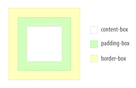
The border-box value is set by default, and the background image is not cropped at all.

The value of padding-box slices the background along the inner edge of the frame area.

The value of content-box slices the background along the edge of the content area.

Comments

  • index.html
  • style.css
HTML
<!DOCTYPE html> <html lang="en"> <head> <title>Background Cropping</title> <meta charset="utf-8"> <link rel="stylesheet" href="setting.css"> <link rel="stylesheet" href="style.css"> </head> <body class="set"> <div class="portrait portrait-small"></div> <div class="portrait portrait-full"></div> </body> </html>
CSS
.portrait { box-sizing: border-box; padding: 20px; width: 250px; height: 250px; border: 20px solid rgba(255, 255, 0, 0.4); background: url("img/muffin.jpg") no-repeat #ffffff; background-size: 100% 100%; } .portrait-small { background-origin: content-box; } .portrait-full { background-origin: border-box; }

What didn’t you like in this task?

Thanks! We’ll fix everything at once!

The code has changed, click “Refresh” or turn autorun on.

You’ve gone to a different page

Click inside the mini-browser to shift the focus onto this window.

100%
Goalscompleted
0
    1. For the .portrait-small portrait, assign the background-clip property with the padding-box value ,
    2. and then change the value to content-box.
    3. For the .portrait-full portrait, assign the background-clip property with the padding-box value ,
    4. and then change the value to content-box.

    Cookies ∙ Privacy ∙ License Agreement ∙ About ∙ Contacts ∙ © HTML Academy OÜ, 2019−2025

    VISAMastercard

    Log in

    or

    Forgot your password?

    Sign up

    Sign up

    or
    Log in

    Restore access

    Have you forgotten your password or lost access to your profile? Enter your email connected to your profile and we will send you a link to restore access.

    Forgot to connect your email to the profile? Email us and we’ll help.