HTML Academy
Muffin’s Eco-Frame
Frames and Backgrounds22/33
Back to the list of tasks
  • 1. Preparation
  • 2. Background Size, Step 1
  • 3. Background Size, Step 2
  • 4. Background Borders
  • 5. Background Cropping
  • 6. Multiple Background Images
  • 7. Positioning the background relative to different borders
  • 8. background-repeat: round
  • 9. background-repeat: space
  • 10. Outer Frame
  • 11. Rounding Corners, Part 1
  • 12. Rounding Corners, Part 2
  • 13. Frame Image: border-image-source
  • 14. Frame Image: border-image-slice
  • 15. Slicing Asymmetrical Images
  • 16. Frame Image: border-image-repeat, Part 1
  • 17. Frame Image: border-image-repeat, Part 2
  • 18. Frame Image: border-image-width
  • 19. Frame Image: border-image-outset
  • 20. Muffin’s Royal Frame
  • 21. Muffin’s Eco-Frame
  • 22. Muffin’s Round Frame, Part 1
  • 23. Muffin’s Round Frame, Part 2
  • 24. Challenge: The Sea Wolf
  • 25. Frames and Triangles, Part 1
  • 26. Frames and Triangles, Part 2
  • 27. Frames and Triangles, Part 3
  • 28. Creating an Arrow with a Frame
  • 29. Creating a Round Arrow with a Frame, Part 1
  • 30. Creating a Round Arrow with a Frame, Part 2
  • 31. Real-Life Triangles, Part 1
  • 32. Real-Life Triangles, Part 2
  • 33. Challenge: Jewelry Work
Muffin’s Round Frame, Part 2
  • Sign up
  • Log in

Loading…
Everything will be ready in few seconds

  • Theory
  • Theory
  • Comments

Muffin’s Round Frame, Part 1

Unfortunately, the border-radius property does not affect border-image, so the only way to make a rounded frame is to use a circular image.

In this assignment and the next one, we will create a rounded portrait of Muffin by using a round frame. To do this, let’s slice the image for the frame as follows:

Image example for the frame

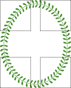
We will also use the fill mode, since the image for the frame is transparent inside.

Comments

  • index.html
  • style.css
HTML
<!DOCTYPE html> <html lang="en"> <head> <title>Muffin’s Round Frame, Part 1</title> <meta charset="utf-8"> <link rel="stylesheet" href="setting.css"> <link rel="stylesheet" href="style.css"> </head> <body> <div class="portrait"></div> </body> </html>
CSS
.portrait { margin: 50px auto; width: 300px; height: 300px; outline: 5px solid white; border: 50px solid transparent; background-color: rgba(255, 255, 255, 0.4); background-image: url("img/muffin-3.jpg"); background-position: center; background-size: cover; background-repeat: no-repeat; }

What didn’t you like in this task?

Thanks! We’ll fix everything at once!

The code has changed, click “Refresh” or turn autorun on.

You’ve gone to a different page

Click inside the mini-browser to shift the focus onto this window.

100%
Goalscompleted
0
    1. Set the frame background image img/leafs-frame.png for the portrait,
    2. assign the value 180 for the border-image-slice property
    3. then add fill to border-image-slice.

    Cookies ∙ Privacy ∙ License Agreement ∙ About ∙ Contacts ∙ © HTML Academy OÜ, 2019−2025

    VISAMastercard

    Log in

    or

    Forgot your password?

    Sign up

    Sign up

    or
    Log in

    Restore access

    Have you forgotten your password or lost access to your profile? Enter your email connected to your profile and we will send you a link to restore access.

    Forgot to connect your email to the profile? Email us and we’ll help.