HTML Academy
Frame Image: border-image-outset
Frames and Backgrounds20/33
Back to the list of tasks
  • 1. Preparation
  • 2. Background Size, Step 1
  • 3. Background Size, Step 2
  • 4. Background Borders
  • 5. Background Cropping
  • 6. Multiple Background Images
  • 7. Positioning the background relative to different borders
  • 8. background-repeat: round
  • 9. background-repeat: space
  • 10. Outer Frame
  • 11. Rounding Corners, Part 1
  • 12. Rounding Corners, Part 2
  • 13. Frame Image: border-image-source
  • 14. Frame Image: border-image-slice
  • 15. Slicing Asymmetrical Images
  • 16. Frame Image: border-image-repeat, Part 1
  • 17. Frame Image: border-image-repeat, Part 2
  • 18. Frame Image: border-image-width
  • 19. Frame Image: border-image-outset
  • 20. Muffin’s Royal Frame
  • 21. Muffin’s Eco-Frame
  • 22. Muffin’s Round Frame, Part 1
  • 23. Muffin’s Round Frame, Part 2
  • 24. Challenge: The Sea Wolf
  • 25. Frames and Triangles, Part 1
  • 26. Frames and Triangles, Part 2
  • 27. Frames and Triangles, Part 3
  • 28. Creating an Arrow with a Frame
  • 29. Creating a Round Arrow with a Frame, Part 1
  • 30. Creating a Round Arrow with a Frame, Part 2
  • 31. Real-Life Triangles, Part 1
  • 32. Real-Life Triangles, Part 2
  • 33. Challenge: Jewelry Work
Muffin’s Eco-Frame
  • Sign up
  • Log in

Loading…
Everything will be ready in few seconds

  • Theory
  • Theory
  • Comments

Muffin’s Royal Frame

Now let’s practice creating frames “with cats.” Or more precisely, with one particular cat by applying different frames to his portraits.

Take the image of the actual image border as the first frame. Take the small areas in the corners of the image to serve as the corners of the frame:

Image example for the frame

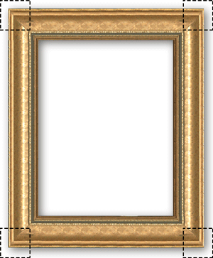
We will also try to slice up the original image by filling in the space between the borders of the frame. Since the image in the middle has a transparent area, Muffin will be visible through it.

And at the end, add a small amount of padding to the graphic frame.

Comments

  • index.html
  • style.css
HTML
<!DOCTYPE html> <html lang="en"> <head> <title>Muffin’s Royal Frame</title> <meta charset="utf-8"> <link rel="stylesheet" href="setting.css"> <link rel="stylesheet" href="style.css"> </head> <body> <div class="portrait"></div> </body> </html>
CSS
.portrait { box-sizing: border-box; margin: 20px auto; padding: 40px; width: 400px; height: 400px; border: 40px solid rgba(0, 0, 0, 0.4); background: url("img/glasses.svg") no-repeat 75px 125px, url("img/muffin.jpg") no-repeat center #ffffff; background-clip: padding-box; background-origin: border-box; background-size: 150px, cover; }

What didn’t you like in this task?

Thanks! We’ll fix everything at once!

The code has changed, click “Refresh” or turn autorun on.

You’ve gone to a different page

Click inside the mini-browser to shift the focus onto this window.

100%
Goalscompleted
0
    1. Set the background image of the img/frame.png frame for the portrait,
    2. assign the value 100 for the border-image-slice property,
    3. then assign the value 100 fill,
    4. and then assign the value 10px to border-image-outset.

    Cookies ∙ Privacy ∙ License Agreement ∙ About ∙ Contacts ∙ © HTML Academy OÜ, 2019−2025

    VISAMastercard

    Log in

    or

    Forgot your password?

    Sign up

    Sign up

    or
    Log in

    Restore access

    Have you forgotten your password or lost access to your profile? Enter your email connected to your profile and we will send you a link to restore access.

    Forgot to connect your email to the profile? Email us and we’ll help.