HTML Academy
Outer Frame
Frames and Backgrounds11/33
Back to the list of tasks
  • 1. Preparation
  • 2. Background Size, Step 1
  • 3. Background Size, Step 2
  • 4. Background Borders
  • 5. Background Cropping
  • 6. Multiple Background Images
  • 7. Positioning the background relative to different borders
  • 8. background-repeat: round
  • 9. background-repeat: space
  • 10. Outer Frame
  • 11. Rounding Corners, Part 1
  • 12. Rounding Corners, Part 2
  • 13. Frame Image: border-image-source
  • 14. Frame Image: border-image-slice
  • 15. Slicing Asymmetrical Images
  • 16. Frame Image: border-image-repeat, Part 1
  • 17. Frame Image: border-image-repeat, Part 2
  • 18. Frame Image: border-image-width
  • 19. Frame Image: border-image-outset
  • 20. Muffin’s Royal Frame
  • 21. Muffin’s Eco-Frame
  • 22. Muffin’s Round Frame, Part 1
  • 23. Muffin’s Round Frame, Part 2
  • 24. Challenge: The Sea Wolf
  • 25. Frames and Triangles, Part 1
  • 26. Frames and Triangles, Part 2
  • 27. Frames and Triangles, Part 3
  • 28. Creating an Arrow with a Frame
  • 29. Creating a Round Arrow with a Frame, Part 1
  • 30. Creating a Round Arrow with a Frame, Part 2
  • 31. Real-Life Triangles, Part 1
  • 32. Real-Life Triangles, Part 2
  • 33. Challenge: Jewelry Work
Rounding Corners, Part 2
  • Sign up
  • Log in

Loading…
Everything will be ready in few seconds

  • Theory
  • Theory
  • Comments

Rounding Corners, Part 1

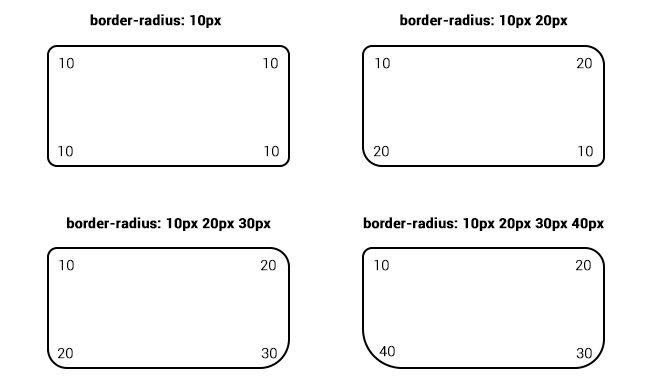
You can round the corners of elements using the border-radius property.

The property sets the radius of corner rounding in pixels or as a percentage. If the block has a frame, then it is rounded.

Rounding a frame with a given value for the border-radius

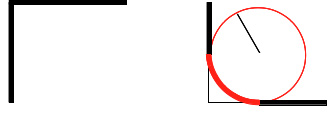
The border-radius property can take one to four arguments.

Rounding options with different border-radius parameters

Comments

  • index.html
  • style.css
HTML
<!DOCTYPE html> <html lang="en"> <head> <title>Rounding Corners, Part 1</title> <meta charset="utf-8"> <link rel="stylesheet" href="setting.css"> <link rel="stylesheet" href="style.css"> </head> <body> <div class="portrait"></div> </body> </html>
CSS
.portrait { box-sizing: border-box; margin: 20px auto; padding: 40px; width: 400px; height: 400px; border: 40px solid rgba(255, 255, 255, 0.4); background-color: #ffffff; background-image: url("img/glasses.svg"), url("img/muffin.jpg"); background-position: 75px 125px, center; background-clip: padding-box; background-origin: border-box; background-size: 150px, cover; background-repeat: no-repeat; }

What didn’t you like in this task?

Thanks! We’ll fix everything at once!

The code has changed, click “Refresh” or turn autorun on.

You’ve gone to a different page

Click inside the mini-browser to shift the focus onto this window.

100%
Goalscompleted
0

    Apply the corner rounding operations to the portrait in the following sequence:

    1. 150px,
    2. 150px 50px,
    3. 50%.

    Cookies ∙ Privacy ∙ License Agreement ∙ About ∙ Contacts ∙ © HTML Academy OÜ, 2019−2025

    VISAMastercard

    Log in

    or

    Forgot your password?

    Sign up

    Sign up

    or
    Log in

    Restore access

    Have you forgotten your password or lost access to your profile? Enter your email connected to your profile and we will send you a link to restore access.

    Forgot to connect your email to the profile? Email us and we’ll help.