HTML Academy
Muffin’s Royal Frame
Frames and Backgrounds21/33
Back to the list of tasks
  • 1. Preparation
  • 2. Background Size, Step 1
  • 3. Background Size, Step 2
  • 4. Background Borders
  • 5. Background Cropping
  • 6. Multiple Background Images
  • 7. Positioning the background relative to different borders
  • 8. background-repeat: round
  • 9. background-repeat: space
  • 10. Outer Frame
  • 11. Rounding Corners, Part 1
  • 12. Rounding Corners, Part 2
  • 13. Frame Image: border-image-source
  • 14. Frame Image: border-image-slice
  • 15. Slicing Asymmetrical Images
  • 16. Frame Image: border-image-repeat, Part 1
  • 17. Frame Image: border-image-repeat, Part 2
  • 18. Frame Image: border-image-width
  • 19. Frame Image: border-image-outset
  • 20. Muffin’s Royal Frame
  • 21. Muffin’s Eco-Frame
  • 22. Muffin’s Round Frame, Part 1
  • 23. Muffin’s Round Frame, Part 2
  • 24. Challenge: The Sea Wolf
  • 25. Frames and Triangles, Part 1
  • 26. Frames and Triangles, Part 2
  • 27. Frames and Triangles, Part 3
  • 28. Creating an Arrow with a Frame
  • 29. Creating a Round Arrow with a Frame, Part 1
  • 30. Creating a Round Arrow with a Frame, Part 2
  • 31. Real-Life Triangles, Part 1
  • 32. Real-Life Triangles, Part 2
  • 33. Challenge: Jewelry Work
Muffin’s Round Frame, Part 1
  • Sign up
  • Log in

Loading…
Everything will be ready in few seconds

  • Theory
  • Theory
  • Comments

Muffin’s Eco-Frame

The previous graphic frame was set to the stretch repeat mode, which is the default. There were no significant distortions caused by stretching the image along the borders of the frame, since the frame itself had large dimensions.

The image for the graphic frame for this assignment has a slightly more uneven pattern than the gold frame that we used in the previous assignment. Let’s take the following parts of it to fill the frame:

Image example for the frame

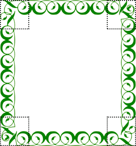
When you use such an image, the repetition modes of the graphic frame will be easily visible: when it is stretched, the borders of the image are significantly distorted, so we try different repetition values in order to find the optimal one.

Comments

  • index.html
  • style.css
HTML
<!DOCTYPE html> <html lang="en"> <head> <title>Muffin’s Eco-Frame</title> <meta charset="utf-8"> <link rel="stylesheet" href="setting.css"> <link rel="stylesheet" href="style.css"> </head> <body> <div class="portrait"></div> </body> </html>
CSS
.portrait { box-sizing: border-box; margin: 20px auto; padding: 40px; width: 400px; height: 400px; border: 40px solid rgba(0, 0, 0, 0.4); background: url("img/glasses.svg") no-repeat 75px 125px, url("img/muffin.jpg") no-repeat center #ffffff; background-clip: padding-box; background-origin: border-box; background-size: 150px, cover; }

What didn’t you like in this task?

Thanks! We’ll fix everything at once!

The code has changed, click “Refresh” or turn autorun on.

You’ve gone to a different page

Click inside the mini-browser to shift the focus onto this window.

100%
Goalscompleted
0
    1. For the portrait, assign the border-image-slice property with a value of 60 to the frame background image img/eco-frame.png,
    2. and then assign the property border-image-repeat with the repeat value
    3. and the round value.

    Cookies ∙ Privacy ∙ License Agreement ∙ About ∙ Contacts ∙ © HTML Academy OÜ, 2019−2025

    VISAMastercard

    Log in

    or

    Forgot your password?

    Sign up

    Sign up

    or
    Log in

    Restore access

    Have you forgotten your password or lost access to your profile? Enter your email connected to your profile and we will send you a link to restore access.

    Forgot to connect your email to the profile? Email us and we’ll help.