HTML Academy
Rounding Corners, Part 1
Frames and Backgrounds12/33
Back to the list of tasks
  • 1. Preparation
  • 2. Background Size, Step 1
  • 3. Background Size, Step 2
  • 4. Background Borders
  • 5. Background Cropping
  • 6. Multiple Background Images
  • 7. Positioning the background relative to different borders
  • 8. background-repeat: round
  • 9. background-repeat: space
  • 10. Outer Frame
  • 11. Rounding Corners, Part 1
  • 12. Rounding Corners, Part 2
  • 13. Frame Image: border-image-source
  • 14. Frame Image: border-image-slice
  • 15. Slicing Asymmetrical Images
  • 16. Frame Image: border-image-repeat, Part 1
  • 17. Frame Image: border-image-repeat, Part 2
  • 18. Frame Image: border-image-width
  • 19. Frame Image: border-image-outset
  • 20. Muffin’s Royal Frame
  • 21. Muffin’s Eco-Frame
  • 22. Muffin’s Round Frame, Part 1
  • 23. Muffin’s Round Frame, Part 2
  • 24. Challenge: The Sea Wolf
  • 25. Frames and Triangles, Part 1
  • 26. Frames and Triangles, Part 2
  • 27. Frames and Triangles, Part 3
  • 28. Creating an Arrow with a Frame
  • 29. Creating a Round Arrow with a Frame, Part 1
  • 30. Creating a Round Arrow with a Frame, Part 2
  • 31. Real-Life Triangles, Part 1
  • 32. Real-Life Triangles, Part 2
  • 33. Challenge: Jewelry Work
Frame Image: border-image-source
  • Sign up
  • Log in

Loading…
Everything will be ready in few seconds

  • Theory
  • Theory
  • Comments

Rounding Corners, Part 2

You can round individual corners using the properties: border-top-left-radius, border-top-right-radius, border-bottom-right-radius, and border-bottom-left-radius.

You can also set different horizontal and vertical rounding radii. To do this, you need to write two values separated by spaces in the corner rounding property. The first value determines the horizontal radius, and the second determines the vertical:

Rounding options with different border-radius parameters

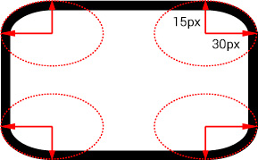
/* Horizontal radius of 30px, vertical radius of 15px */
border-top-right-radius: 30px 15px;

Various horizontal and vertical radii can be set in the border-radius property. To do this, use /. For example:

/* Horizontal radius for all corners of 10px, vertical radius of 5px */
border-radius: 10px / 5px;

/* Different horizontal and vertical radii for each corner */
border-radius: 10px 20px 30px 40px / 5px 15px 25px 35px;

Comments

  • index.html
  • style.css
HTML
<!DOCTYPE html> <html lang="en"> <head> <title>Rounding Corners, Part 2</title> <meta charset="utf-8"> <link rel="stylesheet" href="setting.css"> <link rel="stylesheet" href="style.css"> </head> <body> <div class="portrait"></div> </body> </html>
CSS
.portrait { box-sizing: border-box; margin: 20px auto; padding: 40px; width: 400px; height: 400px; border: 40px solid rgba(255, 255, 255, 0.4); border-top-left-radius: 100px; border-top-right-radius: 100px; background-color: #ffffff; background-image: url("img/glasses.svg"), url("img/muffin.jpg"); background-position: 75px 125px, center; background-clip: padding-box; background-origin: border-box; background-size: 150px, cover; background-repeat: no-repeat; }

What didn’t you like in this task?

Thanks! We’ll fix everything at once!

The code has changed, click “Refresh” or turn autorun on.

You’ve gone to a different page

Click inside the mini-browser to shift the focus onto this window.

100%
Goalscompleted
0

    Assign the following rounding to the portrait:

    1. Set the top left and right corners to 100px 50px,
    2. and set the lower left and right corners to 20% 50%.

    Cookies ∙ Privacy ∙ License Agreement ∙ About ∙ Contacts ∙ © HTML Academy OÜ, 2019−2025

    VISAMastercard

    Log in

    or

    Forgot your password?

    Sign up

    Sign up

    or
    Log in

    Restore access

    Have you forgotten your password or lost access to your profile? Enter your email connected to your profile and we will send you a link to restore access.

    Forgot to connect your email to the profile? Email us and we’ll help.