HTML Academy
Alignment and margins
Flexbox, part 24/28
Back to the list of tasks
  • 1. Flex items and the block model
  • 2. Features of the margin property
  • 3. Alignment and margins
  • 4. The flow direction of the main axis and margins
  • 5. The initial main size of flex item, flex-basis
  • 6. Test: Cubism
  • 7. The item growth factor, flex-grow
  • 8. Growing items proportionally
  • 9. Calculating the total size with flex-grow
  • 10. The item shrinkage factor, flex-shrink
  • 11. Shrinking items proportionally
  • 12. Calculating the total size with flex-shrink
  • 13. flex-shrink and min-width
  • 14. Test: Mastering factors
  • 15. The flex shorthand property
  • 16. Multi-line flex containers and flex-shrink
  • 17. Multi-line flex containers and flex-grow
  • 18. flex-basis: 100% and flex-wrap
  • 19. The heading with description in flexboxes
  • 20. Heading with description, part 2
  • 21. Flexible menu with overflowing content
  • 22. Flexible menu with overflow, part 2
  • 23. Input fields with dynamic width
  • 24. The course card
  • 25. Course card, part 2
  • 26. Course card, part 3
  • 27. So many cards
  • 28. Test: Flexible flows
The initial main size of flex item, flex-basis
  • Sign up
  • Log in

Loading…
Everything will be ready in few seconds

  • Theory
  • Theory
  • Comments

The flow direction of the main axis and margins

Will the result be the same as in the figure below if you rotated the main axis in the previous assignment?

BeforeAfter

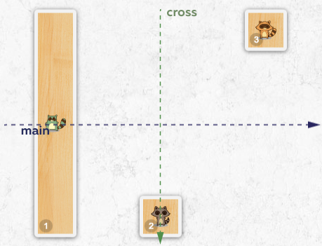
No, it will not be the same!

The old, non-flexbox properties, such as the margins or sizes, know nothing about the flow direction of the axes. They think according to the old paradigm using the concepts of “top” and “bottom”, “right” and “left”.

Therefore, when the main axis is oriented from left to right, horizontal margins move the flex items along the main axis. But if you direct the flow of the main axis from top to bottom, then the same margins will start to function along the cross axis.

The same applies to vertical margins.

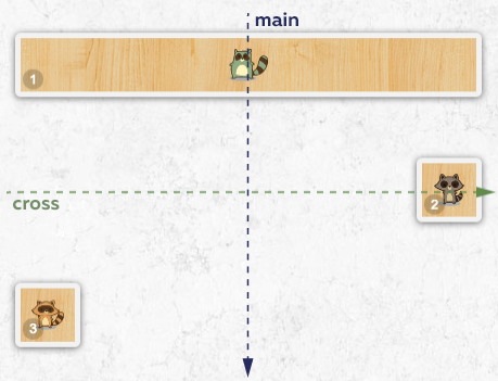
Let’s rotate the axis and then make changes and obtain the result depicted in the figure above.

Comments

  • index.html
  • style.css
HTML
<!DOCTYPE html> <html lang="en"> <head> <meta charset="utf-8"> <title>The flow direction of the main axis and margins</title> <link href="course.css" rel="stylesheet"> <link href="style.css" rel="stylesheet"> </head> <body class="world"> <div class="spot"> <div class="skate skate-1 racoon-green"></div> <div class="skate skate-2 racoon-brown"></div> <div class="skate skate-3 racoon-orange"></div> </div> </body> </html>
CSS
.spot { display: flex; align-items: stretch; justify-content: space-around; } .skate { margin: 10px; min-width: 50px; min-height: 50px; } .skate-2 { margin-top: auto; } .skate-3 { align-self: flex-end; margin-bottom: auto; }

What didn’t you like in this task?

Thanks! We’ll fix everything at once!

The code has changed, click “Refresh” or turn autorun on.

You’ve gone to a different page

Click inside the mini-browser to shift the focus onto this window.

100%
Goalscompleted
0
    1. Change the direction of the main axis to column for .spot.
    2. Then delete the margin-top property from the second skateboard and add the margin-left: auto; property.
    3. Delete the margin-bottom property from the third skateboard and add the margin-right: auto; property.

    Cookies ∙ Privacy ∙ License Agreement ∙ About ∙ Contacts ∙ © HTML Academy OÜ, 2019−2025

    VISAMastercard

    Log in

    or

    Forgot your password?

    Sign up

    Sign up

    or
    Log in

    Restore access

    Have you forgotten your password or lost access to your profile? Enter your email connected to your profile and we will send you a link to restore access.

    Forgot to connect your email to the profile? Email us and we’ll help.