Summary of “Flexbox, Part 1”
Flexbox
Flexbox is a CSS mechanism that allows you to control the size, order, and alignment of items along several axes, the distribution of free space between items, and much more.
In order to enable the flexbox, you need to assign the display: flex; property to the item. Then:
- The item containing
display: flex;is transformed into a flex container. - The immediate children of this item will be transformed into flex items, and they will start to be arranged according to the new rules.
Main and Cross Axes
Axes represent one of the basic concepts in Flexbox.
When a document flows normally, blocks and text are arranged from left to right and from top to bottom.
Under the traditional block model, the directions “left”, “right”, “top”, and “bottom” cannot be changed. But within a flex container you can modify these concepts, since you can change the typical direction of the flow.
- The main axis of the flex container is the direction along which all of its child items are arranged. The flex items flow along the main axis from the start to the end of it.
- We call the direction that is perpendicular to the main axis the cross axis. The “vertical” alignments are made along this axis.
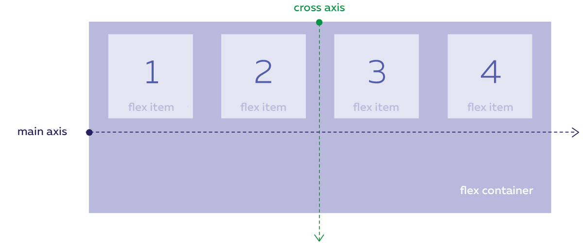
By default, the main axis flows from left to right, but it can be rotated in all directions using the flex-direction property, which is assigned for the flex container. Value properties:
- The following are the default values:
row– The main axis flows from left to right. column— The main axis flows from top to bottom.row-reverse— The main axis flows from right to left.column-reverse— The main axis flows from bottom to top.
The cross axis is always perpendicular to the main axis, and when the latter is rotated, the former rotates too to stay perpendicular:
- If the main axis flows horizontally, then the cross axis will flow vertically down.
- If the main axis flows vertically, then the cross axis will flow to the right.
Thus, the cross axis will never flow up or to the left, and there is no property that rotates the cross axis.
Arrangement of Flex Items
Main axis alignment
The justify-content CSS property determines how items are aligned along the main axis. Available values for justify-content:
- The following are the default values:
flex-start– Items are arranged at the start of the main axis. flex-end— Items are arranged at the end of the main axis.center— Items are arranged in the center of the main axis.space-between— Items are arranged so that the distances between adjacent ones are uniform, and there are no margins between the items and the edges of the flex container.space-around— Items are arranged in such a way that the distances between neighboring items are uniform, and there is a margin between the items and the edges of the flex container that is equal to half of the distance between neighboring items.
Alignment along the cross axis
The align-items CSS property determines how items are aligned along the cross axis. Available values for align-items:
- Default value of
stretch– Items are stretched to fill the entire “height” of the flex container. flex-start— Items are arranged at the start of the cross axis.flex-end— Items are arranged at the end of the cross axis.center— Items are arranged in the center of the cross axis.baseline— Items are aligned along the baseline of the text inside them.
The arrangement of items along the main axis is assigned for the entire flex container, and the arrangement properties apply to all flex items equally. You are not allowed to assign an arrangement to one particular item along the main axis that differs from the one assigned to the other items.
The cross alignment can be assigned to each item separately. To do this, you can use the align-self property, which is assigned for the flex items themselves and not for the flex container. The align-self property has the very same values as align-items.
Flex Item Overflow
If you add more flex items to a container than can fit in a single row, then
- they will be shrunk to the smallest possible width.
- Even if you assign a width to them, the flexbox mechanism can override this setting and shrink it.
- If they can no longer be fit in a container after it is shrunk, they will overflow its boundaries, but they will continue to be placed in a single row.
To avoid this, you need to use the flex-wrap flex container property. It has two values:
- The default value
nowrap— Flex items cannot overflow onto a new line. wrap— The overflow of flex items to a new line is allowed. Rows of items are arranged along the cross axis, where the first row is at the start of the cross axis and the last is at the end.wrap-reverse— The overflow of flex items onto a new line is also allowed. Rows of items are arranged in reverse order: the first row is placed at the end of the cross axis, and the last is placed at the start.
Aligning Lines in the Flex Container
The align-content property controls the alignment of rows of flex items along the cross axis. It along with the justify-content property have very similar values:
- The default value
stretchstretches the rows of flex items, while the remaining free space between them is distributed equally. How lines are displayed depends on the value of thestretch- If
align-itemshas been assigned the valuestretch, then the items in the lines will be stretched to the entire height of their respective lines. - If the value differs from
stretch, then the items in the rows are compressed to the size of their own contents and are aligned in the rows depending on the value ofalign-items.
- If
flex-start— Arranges rows of flex items at the start of the cross axis,flex-end— Arranges rows of flex items at the end of the cross axis,center- Arranges rows of flex items in the middle of the cross axis so that there are no margins between adjacent rows, and the distance between the first row and the edge of the flex container is equal to the distance between the last row and the other edge.space-between- Evenly distributes the rows of flex items along the cross axis. The distances between adjacent rows are the same, but there are no margins at the edges.space-around- Evenly distributes the rows of flex items along the cross axis. The distances between adjacent rows are the same, but the margins at the edges are equal to half of the distance between neighboring rows.
The align-content property overrides any other assigned value of align-items, which controls the alignment of the flex items along the cross axis. This happens when there is only one row of flex items and where there are several such rows.
Previously the specification prescribed a different behavior:
- If there is only one row of flex items, then
align-itemstakes precedence. - If there are several rows, then
align-contenttakes precedence.
In early 2019, the behavior was updated in all modern browsers according to the specification. The older behavior can only be found now in older browser versions.
The Flex Item Sequence Number
The order in which flex items are displayed in the stream can be changed using the order property, which is used to assign a sequence number to the flex item without having to change the HTML code.
By default, the sequence number of the flex items is equal to 0, and the items are sorted in ascending order starting from this value. The sequence number is an integer, which can be either positive or negative.
Using Flexboxes
Perfect Alignment
You can use a flexbox to center an item vertically and horizontally so that the alignment is maintained when the item or container is resized.
To do this, you need to set the flexbox layout for the container and margin: auto for the child flex item. In this case, the flex item will shrink in size to match the content and will be centered along the vertical and horizontal axes.
Flexible Menus
Flexbox is useful if you need to create a layout in which the items are evenly distributed across the menu block, where the first item is aligned to the left side of the menu block, and the last item is aligned to the right side, with small internal margins.
To do this, you need to set the flexbox layout menu. Then the items will become flex items. Then you can use the justify-content: space-around; property for arranging items to achieve the desired result.
If you add another item to the menu, the margins between the menu items will change “flexibly” and adapt to the new conditions.
Sorting Items in CSS
By using Flexbox and the checkbox selector :checked ~ at the same time, you can control the order of the flex items using this selector by changing the direction of the main axis using flex-direction.
The effect works best when the direction of the main axis changes from “top to bottom” to “bottom to top”. In this case, the flex container should be on the same level in the markup as the checkbox.
Blocks with Uniform Height
The usual block model has a fundamental drawback: the neighboring blocks are totally unaware of each other, so there is no way to control their heights as a group. It should be borne in mind that the contents of the blocks may differ and their heights may vary.
You can implement a layout using blocks of the same height using Flexbox. The flex items are stretched by default to the entire height of their respective containers. To do this, just assign display: flex; to the parent block.
Continue