- Theory
- Theory
- Comments
Animation form, animation-timing-function
Finally, the most important property is animation-timing-function. It defines how an animation will be played: at what speed and with what acceleration its properties will change.
In the previous examples, animations were played with identical dynamics: we only changed their durations, but not their “form”. By default, this “form” corresponds to the first graph, which shows that the animation starts slowly then accelerates towards the end and slows down again closer to the end.
That’s how the ease value of the animation-timing-function property works.
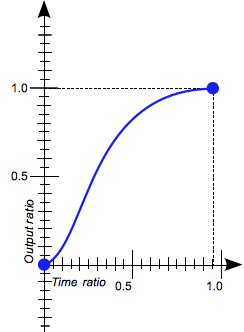
ease
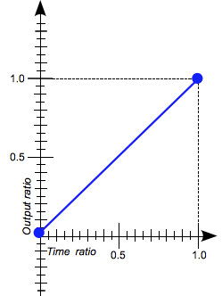
linear
However, we can make the animation’s playback uniform, without acceleration or deceleration. To do this, use the linear value. As you can see in the second graph, the animation will be played at a constant speed.
- index.html
- style.css
You’ve gone to a different page
- Set the linear animation type to both
.robotrobots.
Comments