HTML Academy
Preparing the round menu
2D Transforms28/32
Back to the list of tasks
  • 1. Moving objects horizontally
  • 2. Moving objects vertically
  • 3. Fireball training
  • 4. Increasing and decreasing the size
  • 5. Defending the city
  • 6. The beginning of the journey
  • 7. The maze
  • 8. The battle, part 1
  • 9. The battle, part 2
  • 10. Test: The mysterious card
  • 11. The battle, part 3
  • 12. Test: The shattered crystal
  • 13. The final battle
  • 14. Features of transform-origin, part 1
  • 15. Features of transform-origin, part 2
  • 16. Features of transform-origin, part 3
  • 17. Features of transform-origin, part 4
  • 18. Centering with transform: translate
  • 19. Rotating the text in blocks
  • 20. Rotating the text in the background
  • 21. Custom shadows
  • 22. On-hover effects: buttons, part 1
  • 23. On-hover effects: buttons, part 2
  • 24. On-hover effects: buttons, part 3
  • 25. On-hover effects: the gallery
  • 26. The “stack” of cards
  • 27. Preparing the round menu
  • 28. Round menu, step 1
  • 29. Round menu, step 2
  • 30. Round menu, step 3
  • 31. The round menu, final part
  • 32. Test: Arranging the cards
Round menu, step 2
  • Sign up
  • Log in

Loading…
Everything will be ready in few seconds

  • Theory
  • Theory
  • Comments

Round menu, step 1

Now you can calculate the angles of the menu sectors and the reverse angles of the menu items. Let’s use the following formulas:

[sector angle] = 360° / [number of menu items]
[reverse of menu item n] = (n - 1) * [sector angle]

Our menu can contain a maximum of 6 menu items. Therefore, we will obtain the following values for it:

[sector angle] = 360°/6 = 60°
[reverse of menu item 1] = (1-1) * 60° = 0°
[reverse of menu item 2] = (2-1) * 60° = 60°

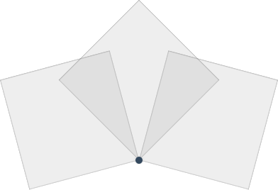
In order to rotate the menu items, we use rotate. But one rotation alone is not enough, since the list items will intersect, because their angle is greater than 60°.

In order to fix this, we will skew the menu items using skew. And we calculate the skew angle as follows:

[skew angle] = 90° - [sector angle]

In our case, we get 30°.

In total: the first list item must be skewed 30°, and the second one must be rotated 60° and then skewed 30°.

By the way, you can use two types of notation:

transform: rotate(60deg) skew(30deg); // 1st option
transform: skew(30deg) rotate(60deg); // 2nd option

Their effect will be different, since the order of the transforms is important. And we need the first option.

Comments

  • index.html
  • style.css
HTML
<!DOCTYPE html> <html lang="en"> <head> <title>Round menu, step 1</title> <meta charset="utf-8"> <link rel="stylesheet" href="style.css"> </head> <body> <nav class="circle-menu"> <div class="center"></div> <ul> <li><a href="#">monitor</a></li> <li><a href="#">aperture</a></li> </ul> </nav> </body> </html>
CSS
body { margin: 0; padding: 0; background-color: #f5f5f5; } .circle-menu { position: relative; width: 400px; height: 400px; margin: 50px auto; background-color: white; box-shadow: 0 0 3px #cccccc; } .circle-menu ul { position: absolute; width: 300px; height: 300px; margin: 50px; padding: 0; list-style: none; box-shadow: 0 0 0 1px #3498db; } .circle-menu .center { position: absolute; top: 195px; left: 195px; z-index: 1000; border: 5px solid #34495e; border-radius: 50%; box-shadow: 0 0 3px #cccccc; } .circle-menu li { position: absolute; top: -10px; left: -10px; width: 160px; height: 160px; background-color: rgba(145, 145, 145, 0.1); box-shadow: inset 0 0 1px #cccccc; transform-origin: 100% 100%; } .circle-menu li:nth-child(1) { transform: none; } .circle-menu li:nth-child(2) { transform: none; } .circle-menu li a { font-size: 0; }

What didn’t you like in this task?

Thanks! We’ll fix everything at once!

The code has changed, click “Refresh” or turn autorun on.

You’ve gone to a different page

Click inside the mini-browser to shift the focus onto this window.

100%
Goalscompleted
0
    1. Skew the first list item 30°.
    2. Rotate the second list item 60°, and skew it 30°.

    Cookies ∙ Privacy ∙ License Agreement ∙ About ∙ Contacts ∙ © HTML Academy OÜ, 2019−2025

    VISAMastercard

    Log in

    or

    Forgot your password?

    Sign up

    Sign up

    or
    Log in

    Restore access

    Have you forgotten your password or lost access to your profile? Enter your email connected to your profile and we will send you a link to restore access.

    Forgot to connect your email to the profile? Email us and we’ll help.