HTML Academy
Fireball training
2D Transforms4/32
Back to the list of tasks
  • 1. Moving objects horizontally
  • 2. Moving objects vertically
  • 3. Fireball training
  • 4. Increasing and decreasing the size
  • 5. Defending the city
  • 6. The beginning of the journey
  • 7. The maze
  • 8. The battle, part 1
  • 9. The battle, part 2
  • 10. Test: The mysterious card
  • 11. The battle, part 3
  • 12. Test: The shattered crystal
  • 13. The final battle
  • 14. Features of transform-origin, part 1
  • 15. Features of transform-origin, part 2
  • 16. Features of transform-origin, part 3
  • 17. Features of transform-origin, part 4
  • 18. Centering with transform: translate
  • 19. Rotating the text in blocks
  • 20. Rotating the text in the background
  • 21. Custom shadows
  • 22. On-hover effects: buttons, part 1
  • 23. On-hover effects: buttons, part 2
  • 24. On-hover effects: buttons, part 3
  • 25. On-hover effects: the gallery
  • 26. The “stack” of cards
  • 27. Preparing the round menu
  • 28. Round menu, step 1
  • 29. Round menu, step 2
  • 30. Round menu, step 3
  • 31. The round menu, final part
  • 32. Test: Arranging the cards
Defending the city
  • Sign up
  • Log in

Loading…
Everything will be ready in few seconds

  • Theory
  • Theory
  • Comments

Increasing and decreasing the size

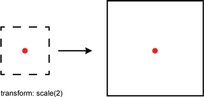
Another feature of CSS transforms is that you can use them to scale blocks. You can use the scale function to increase or decrease the size of elements.

The value of this function can be any number. In this case, the value 1 is considered to be the reference point, where the block has its original dimensions. Consider the following examples:

  • scale(0.5) halves the size of the object.
  • scale(2) doubles the size of the object.
  • scale(0) completely collapses the object so that it is no longer visible.
  • scale(1) leaves the object unchanged.

How the scale function works

Generally speaking, the scale function, just like translate, takes two arguments:

scale(scale-by-X [, scale-by-Y])

If the optional argument scale-by-Y is not set, then it is considered to take the same value as scale-by-X:

transform: scale(2) is the same as transform: scale(2, 2)

In addition, when we need to scale the object only along one axis independently of the other, we can use the functions scaleX(scale-by-X) and scaleY(scale-by-Y).

Comments

  • index.html
  • style.css
HTML
<!DOCTYPE html> <html lang="en"> <head> <title>Increasing and decreasing the size</title> <meta charset="utf-8"> <link rel="stylesheet" href="world.css"> <link rel="stylesheet" href="style.css"> </head> <body> <div class="world"> <div class="wizard"> </div> <div class="hippo"> </div> <div class="mouse"> </div> </div> </body> </html>
CSS
.hippo { } .mouse { } .wizard { top: 244px; left: 40px; }

What didn’t you like in this task?

Thanks! We’ll fix everything at once!

The code has changed, click “Refresh” or turn autorun on.

You’ve gone to a different page

Click inside the mini-browser to shift the focus onto this window.

100%
Goalscompleted
0
    1. Reduce the dimensions of the .hippo hippo figure by adding the transform: scale(0.25) transform to it.
    2. Increase the size of the .mouse mouse threefold: transform: scale(3).

    Cookies ∙ Privacy ∙ License Agreement ∙ About ∙ Contacts ∙ © HTML Academy OÜ, 2019−2025

    VISAMastercard

    Log in

    or

    Forgot your password?

    Sign up

    Sign up

    or
    Log in

    Restore access

    Have you forgotten your password or lost access to your profile? Enter your email connected to your profile and we will send you a link to restore access.

    Forgot to connect your email to the profile? Email us and we’ll help.