- Theory
- Theory
- Comments
transition-timing-function, step 2
Here are several more transition forms: ease-in, ease-out, and ease-in-out.
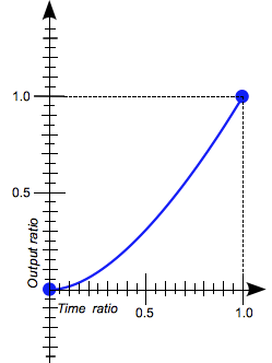
ease-in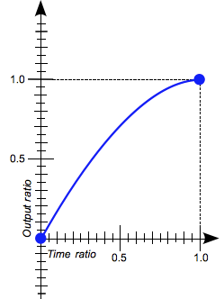
ease-out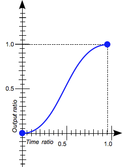
ease-in-out
From the graphs, you can see that for the ease-in value the transition begins slowly, and towards the end it accelerates, where as for ease-out it starts quickly and slows down towards the end. The ease-in-out value is similar to ease, that is, the transition begins and ends slowly, but it happens a little bit more intensely.
Let’s try these values of the transition-timing-function property.
- index.html
- style.css
HTML
<!DOCTYPE html>
<html lang="en">
<head>
<title>transition-timing-function, step 2</title>
<meta charset="utf-8">
<link rel="stylesheet" href="material.css">
<link rel="stylesheet" href="style.css">
</head>
<body class="theory-theme">
<button class="fab fab-play" type="button"></button>
<div class="row">
<span class="square"></span>
</div>
<div class="row">
<span class="square square-experimental"></span>
</div>
</body>
</html>
CSS
.square {
left: 0;
transition-timing-function: linear;
transition-duration: 3s;
transition-property: left, border-radius;
}
.square-active {
left: 75%;
border-radius: 50%;
}
.square-experimental {
background-color: #e74c3c;
}
You’ve gone to a different page
Goalscompleted
0
Set the following transition shapes for the .square-experimental square one after the other:
ease-in,ease-out,ease-in-out.
Click the .fab-play button to start a smooth transition.
Comments