HTML Academy
Diagonal Gradients
Linear Gradients4/23
Back to the list of tasks
  • 1. Hello, linear-gradient!
  • 2. Gradient Direction
  • 3. Diagonal Gradients
  • 4. Gradients at an Angle
  • 5. Diagonals vs. Degrees
  • 6. Challenge: Application Icons
  • 7. Uniform Multicolor Gradient
  • 8. Color Proportions and Color Stops
  • 9. Sharp Color Transitions
  • 10. Pseudo-Columns on Gradients
  • 11. Challenge: Flags
  • 12. Color Transitions in px
  • 13. Semi-Transparent Gradients
  • 14. Repeating Linear Gradient
  • 15. Creating a Complex Background – Part 1
  • 16. Creating a Complex Background – Part 2
  • 17. Creating a Complex Background – Part 3
  • 18. Let’s Create a Complex Background – Final Step
  • 19. Buttons – Part 1
  • 20. Buttons – Part 2
  • 21. Buttons – Part 3
  • 22. Challenge: Ornament Made of Shurikens
  • 23. Challenge: Satellites
Diagonals vs. Degrees
  • Sign up
  • Log in

Loading…
Everything will be ready in few seconds

  • Theory
  • Theory
  • Comments

Gradients at an Angle

The direction of the linear gradient can also be specified as an arbitrary angle, for example, 245°. The direction in degrees is specified using the unit deg. You can specify positive and negative angles. Examples:

background-image: linear-gradient (90deg, yellow, green);
background-image: linear-gradient (-135deg, yellow, green);

The angles of the gradient are counted like this:

Schematic illustration of the mechanism that is used to calculate the angles in a gradient

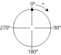
0deg corresponds to 12 o’clock, and the angle is counted clockwise. If the angle is specified with a negative value, for example, -90deg, then it is counted counterclockwise.

In this assignment, you need to write gradients to the remaining three “leaves” by analogy with the first: from the colored edge of the “leaf” to the black center of the “flower”.

Comments

  • index.html
  • style.css
HTML
<!DOCTYPE html> <html lang="en"> <head> <title>Gradients at an Angle</title> <meta charset="utf-8"> <link rel="stylesheet" href="style.css"> </head> <body> <div class="flower"> <div class="leaf leaf-top-left"></div> <div class="leaf leaf-top-right"></div> <div class="leaf leaf-bottom-left"></div> <div class="leaf leaf-bottom-right"></div> </div> </body> </html>
CSS
.leaf-top-left { background-image: linear-gradient(135deg, #ff0000, #000000); } .leaf-top-right { /*gradient from #00ff00 to #000000*/ } .leaf-bottom-right { /*gradient from #ffff00 to #000000*/ } .leaf-bottom-left { /*gradient from #ff00ff to #000000*/ } .leaf-top-left, .leaf-bottom-right { border-radius: 0 50%; } .leaf-top-right, .leaf-bottom-left { border-radius: 50% 0; } .leaf { float: left; margin: 0; width: 150px; height: 150px; background-color: #dfdfdf; } .flower { margin: 0 auto; padding-top: 80px; width: 300px; } html, body { margin: 0; height: 100%; }

What didn’t you like in this task?

Thanks! We’ll fix everything at once!

The code has changed, click “Refresh” or turn autorun on.

You’ve gone to a different page

Click inside the mini-browser to shift the focus onto this window.

100%
Goalscompleted
0

    Finish coloring the flower using gradients:

    1. Assign a gradient at an angle of 225° to the top right leaf.
    2. Assign a gradient at an angle of 315° to the lower right leaf.
    3. Assign a gradient at an angle of 45° to the lower left leaf.

    The colors for the leaves are indicated in the comments in the CSS.

    Cookies ∙ Privacy ∙ License Agreement ∙ About ∙ Contacts ∙ © HTML Academy OÜ, 2019−2025

    VISAMastercard

    Log in

    or

    Forgot your password?

    Sign up

    Sign up

    or
    Log in

    Restore access

    Have you forgotten your password or lost access to your profile? Enter your email connected to your profile and we will send you a link to restore access.

    Forgot to connect your email to the profile? Email us and we’ll help.