- Theory
- Theory
- Comments
Color Rotation, hue-rotate
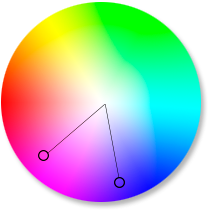
Another interesting color filter is the hue-rotate color rotation.
If we represent all of the colors as a wheel, then we can use this filter to rotate the image color along the wheel by a certain angle.
Thus, you can rotate colors using hue-rotate. The value is set in degrees,
from 0deg to 360deg. You are also allowed to use a negative angle. A positive value will rotate the color clockwise, while a negative angle will rotate it counterclockwise. If the filter value is 0deg, then the element is displayed unchanged.
Examples:
.effect {
  filter: hue-rotate(90deg); /* Rotate clockwise by 90 degrees */
  filter: hue-rotate(-90deg); /* Rotate counterclockwise by 90 degrees */
}- index.html
- style.css
HTML
<!DOCTYPE html>
<html lang="en">
<head>
<meta charset="utf-8">
<title>Color Rotation, hue-rotate</title>
<link href="course.css" rel="stylesheet">
<link href="style.css" rel="stylesheet">
</head>
<body>
<div class="image">
<img src="img/spb-1.jpg" alt="">
</div>
<div class="compare">
<div class="compare-left hue-rotate">
<div class="image">
<img src="img/spb-1.jpg" alt="">
</div>
</div>
<div class="compare-right hue-rotate-reverse">
<div class="image">
<img src="img/spb-1.jpg" alt="">
</div>
</div>
</div>
</body>
</html>
CSS
.hue-rotate img {
}
.hue-rotate-reverse img {
}
You’ve gone to a different page
Goalscompleted
0
- For the image
.hue-rotate img, assign the value90degto thehue-rotatefilter, - and then change the value to
270deg. - For the image
.hue-rotate-reverse img, apply a-180degcolor rotation filter.
Comments